Logitech - Remote Conferencing Experience
How we design a smart conferencing solution can be used with multiple types of video meeting software in the post-pandemic
About
In the post-pandemic era, there’s a strong need for connectivity across the workplace for adjusting the hybrid working mode. Working with the Logitech product team and sales team, we design the user interface and digital management platform for the smart conference solution - GATHER, which can fit into different virtual meeting software.
In the post-pandemic era, there’s a strong need for connectivity across the workplace for adjusting the hybrid working mode. Working with the Logitech product team and sales team, we design the user interface and digital management platform for the smart conference solution - GATHER, which can fit into different virtual meeting software.
Tool
Figma
FigJam
ProtoPie
Slack
Keynote
Figma
FigJam
ProtoPie
Slack
Keynote
Duration
12 Weeks
12 Weeks
My Role
Stakeholder Interviews, Heuristic Analysis, UX Prototyping, Participants Recruitment, Usability Testing, Insight Synthesizing
Stakeholder Interviews, Heuristic Analysis, UX Prototyping, Participants Recruitment, Usability Testing, Insight Synthesizing
Define
Problem
The very first prototype had not been validated by the target audience yet
With the rise of remote work due to the pandemic, companies hold more conferences than ever. Logitech wanted to create a new conference phone with advanced audio quality and voice AI technology to capture market share. However, the internal design team's quick prototype still requires validation and iteration to refine its features and details.The Ask
How to design a compelling conferencing experience based on the prototype designed by the internal team?
Process
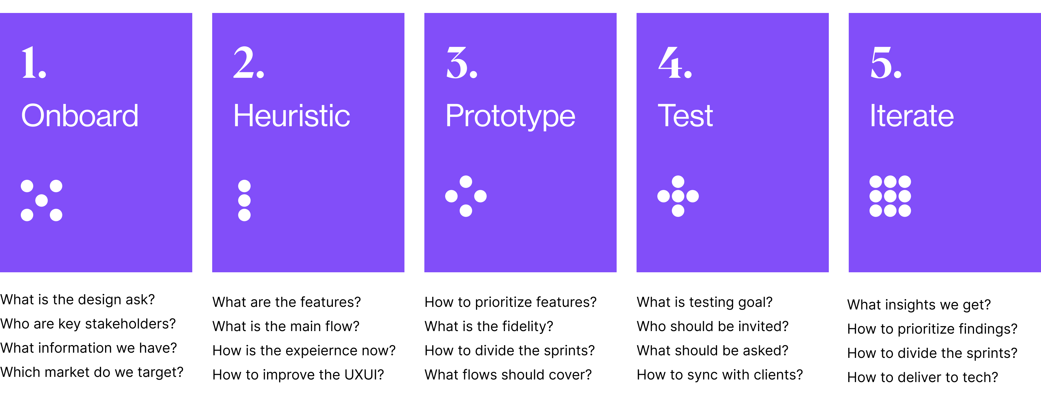
We developed our product through the following four phases: Onboard, Heuristic, Prototype, Test, and Iterate.
We started the project with a bunch of current documents, including a go-to-market plan, information architecture assumption, prototype 2.0, the newest brand book, etc.

Onboard
Interview Stakeholder
Interviewed with the project director, product manager, tech engineer, and sales manager


Digested relevant documents introduced by key stakeholders
The documents included a creative brief, brand book, information architecture, prototype walkthrough, market research, competitor analysis, and tech diagram.
Define Audience
Targeting small to medium enterprises with less than 500 employees to differentiate from competitors
In China, more than 80% of enterprises have nothing in the meeting room, and 78.5% expect collaborative communication. The product is designed for office employees and IT managers who would like to have an easy set-up, plug-and-play, and simple-use solution.
Heuristic
Audit Current Experience
Audit the holistic experience including user flow, user interface, and brand identity.
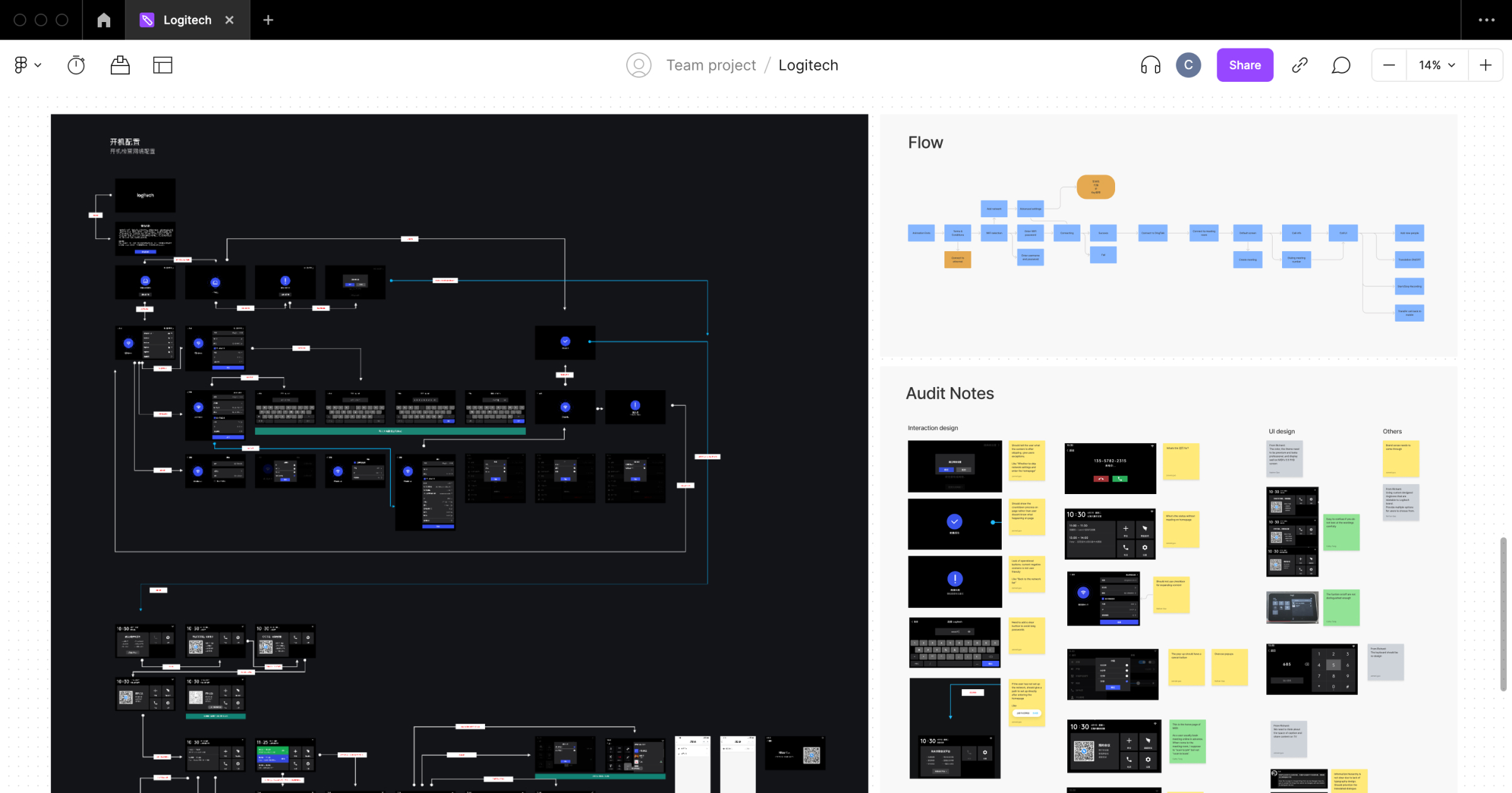
We mapped out all the features and user flows in FigJam. Asking project managers, UIUX designers, service designers, technologists, and irrelevant team members to dive audit notes into details. In the end, we categorized notes into three modules. 1. Interaction Design; 2. Information Hierarchy; 3. Visual Design.
Interaction Design
Mismatched Mental Model
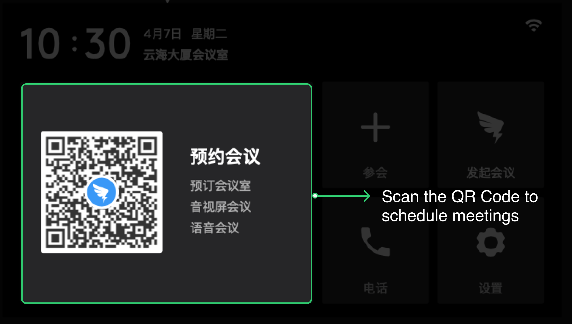
Every user has their own mental model—internal beliefs about how your product works. For example, users usually schedule meetings via conferencing software rather than conferencing phone.

Information Hierarchy
Unclear UX Writing
Designers often overlook aspects of UX writing. For example, it’s confusing that “join” represents “starting a new meeting” and “attend” represents “joining a current meeting”
